Mishergas is tackling a major environmental challenge: used tire waste. Their innovative approach utilizes eco-industrial technologies to transform tires into valuable resources, creating a sustainable and profitable business model. I was tasked with developing a brand identity that embodies Mishergas's commitment to environmental responsibility and economic viability.
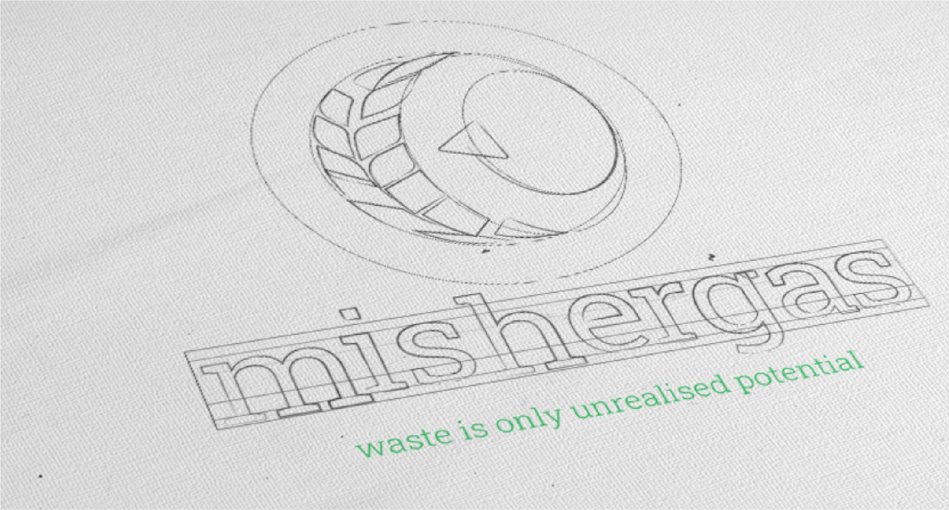
When approaching the logo design for Mishergas, I wanted to create a visual identity that powerfully communicates both the company’s environmental mission and its innovative industrial approach. Every element in the logo is intentional and symbolic.
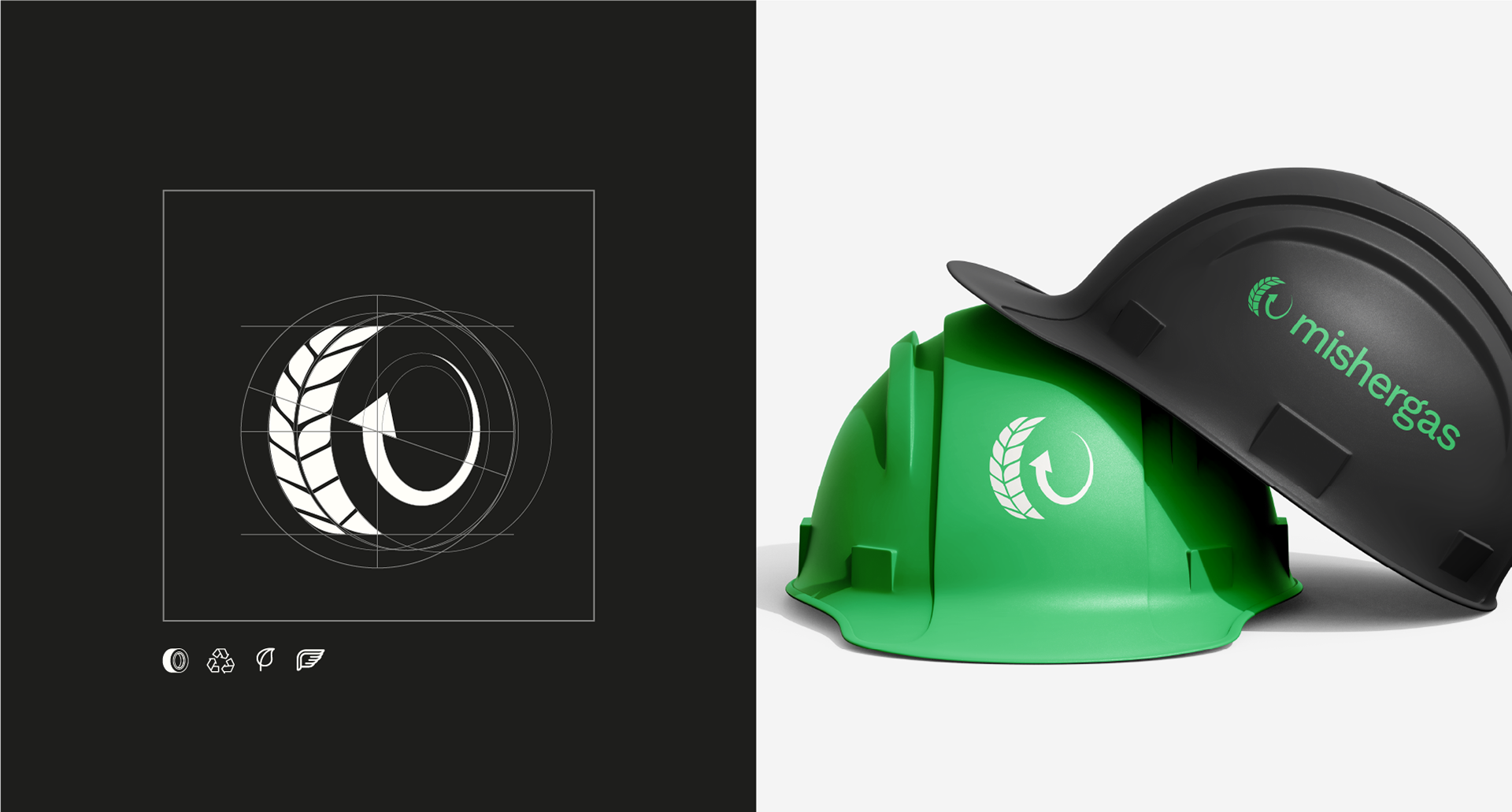
The most prominent feature of the logo is the visual transformation of a tire tread pattern into leaves. This metaphor captures the core mission of Mishergas—turning environmental waste into green solutions. The tire, a symbol of industrial waste, gradually transitions into organic leaf forms, representing renewal, growth, and sustainability.
At the center of the logo, the inner circle of the tire is depicted as an arrow, forming a closed-loop. This represents movement, transformation, and the circular economy—a journey from waste to value. The arrow enhances the narrative of progress and continuous innovation.
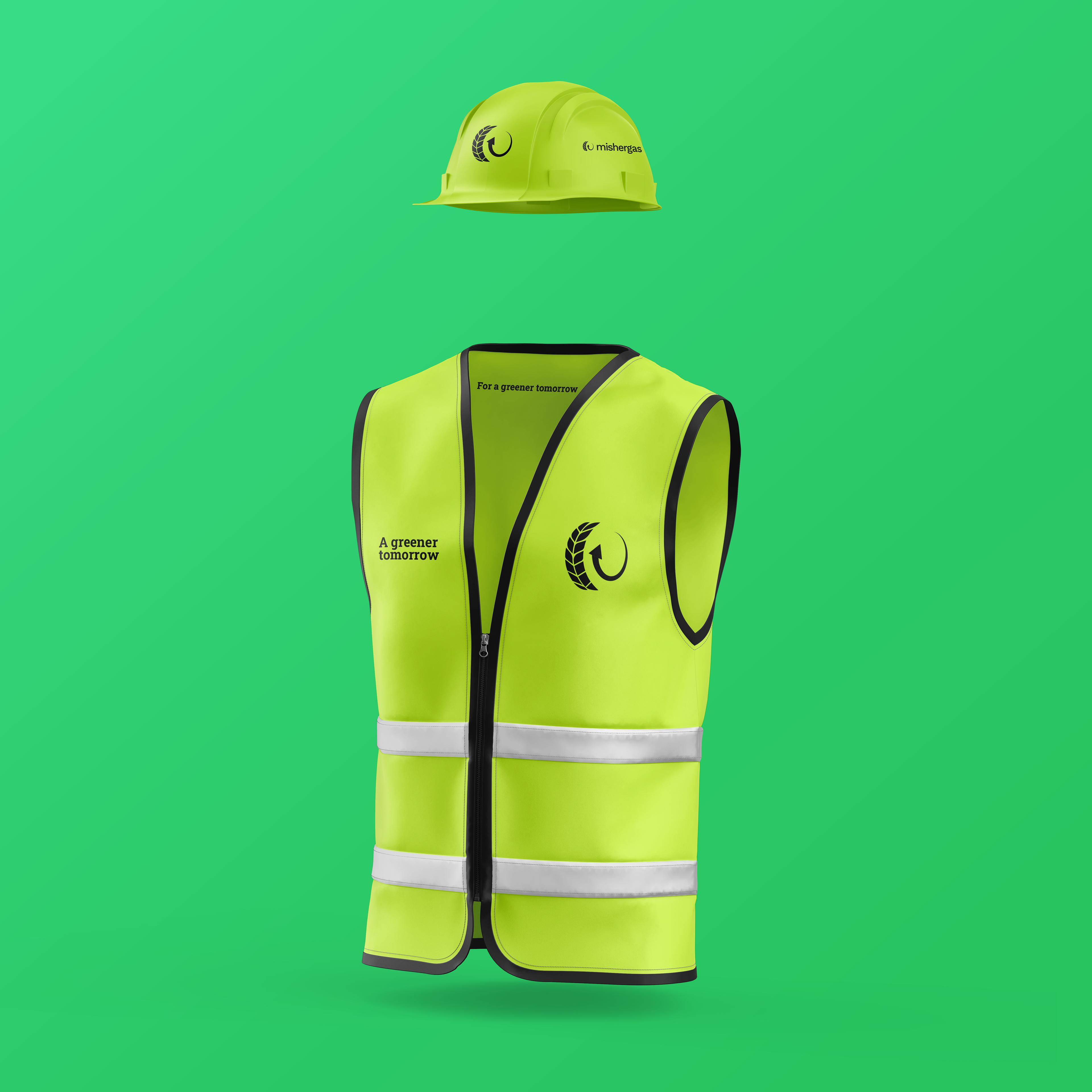
The Mishergas logo effectively encapsulates the essence of the brand: a green journey of transformation, where industrial waste becomes a symbol of renewal and progress. It balances eco-conscious messaging with the professionalism expected in commercial and industrial markets, resulting in a powerful and meaningful brand identity.