Portfolio
Motion Reel
Data-Driven Design Animation
Logofolio
Print Design
Lavantic Brand
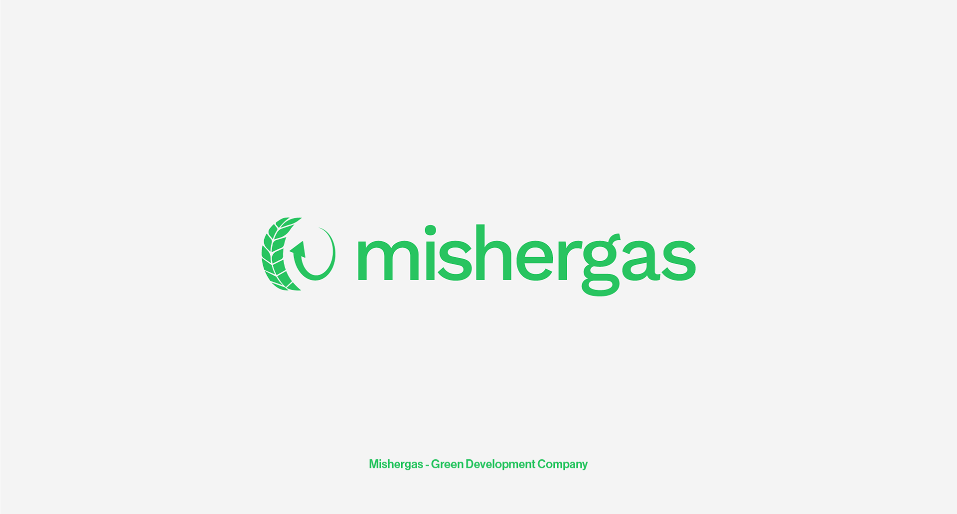
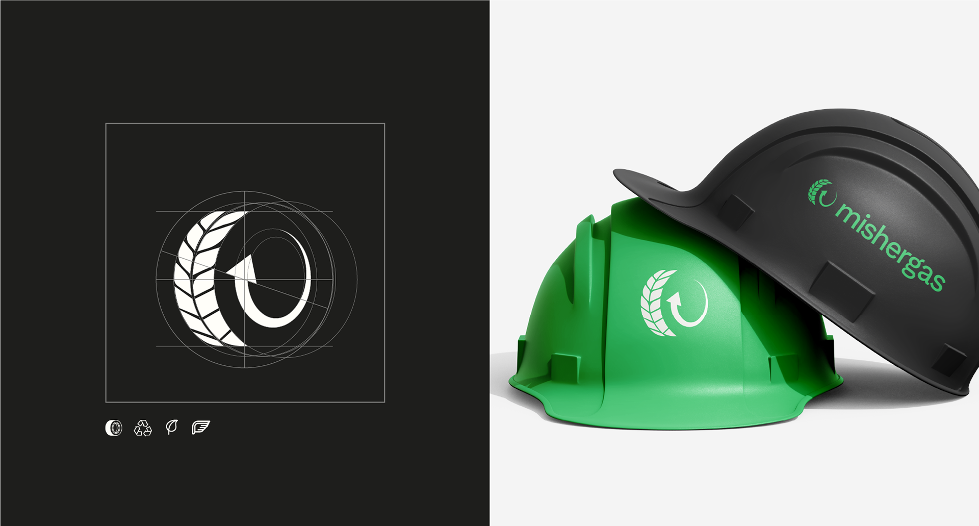
Mishergas Brand
Hey Adam Animation
OPSRC Animation
Lab
About
Contact
Portfolio
Motion Reel
Data-Driven Design Animation
Logofolio
Print Design
Lavantic Brand
Mishergas Brand
Hey Adam Animation
OPSRC Animation
Lab
About
Contact
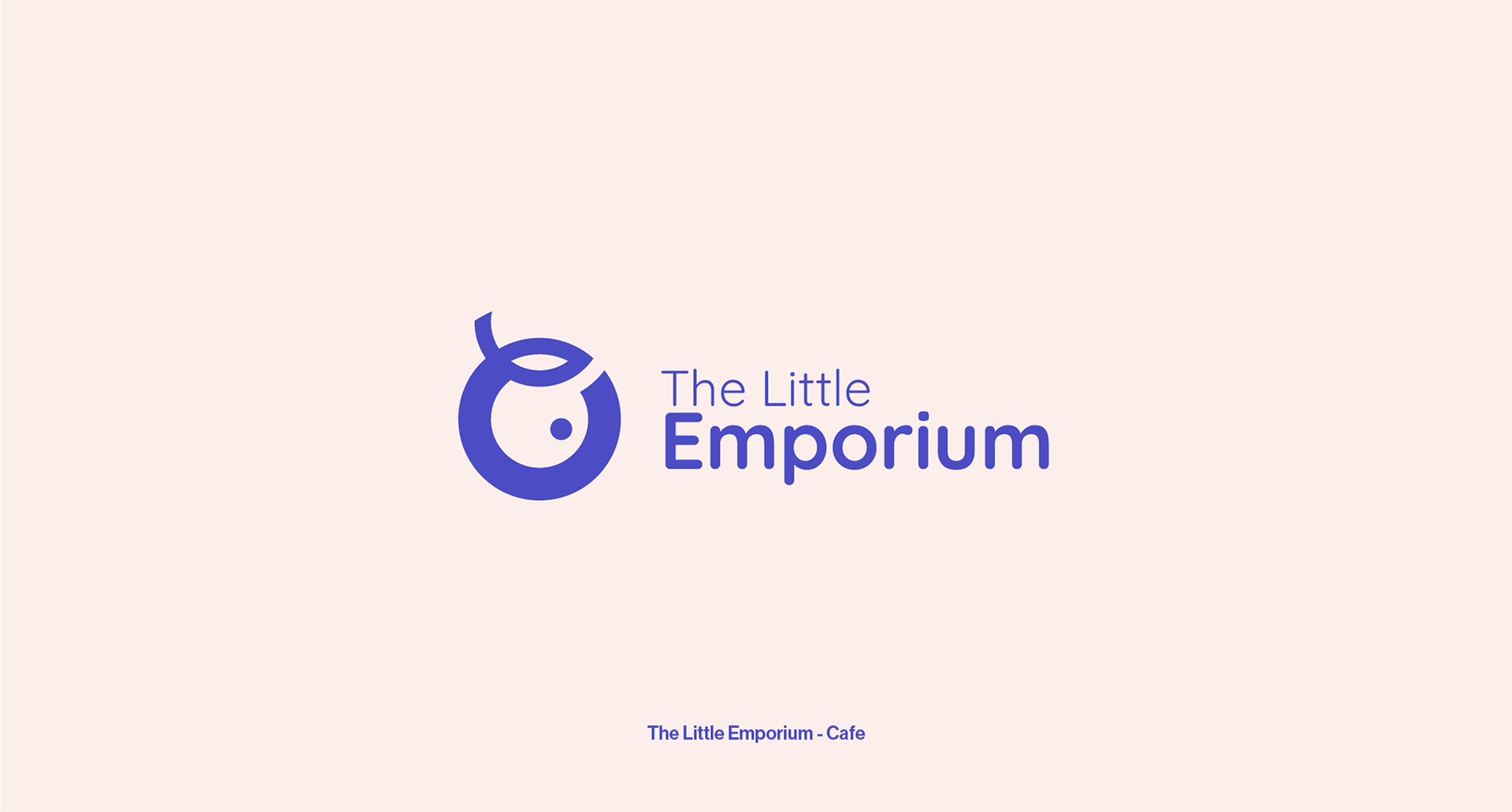
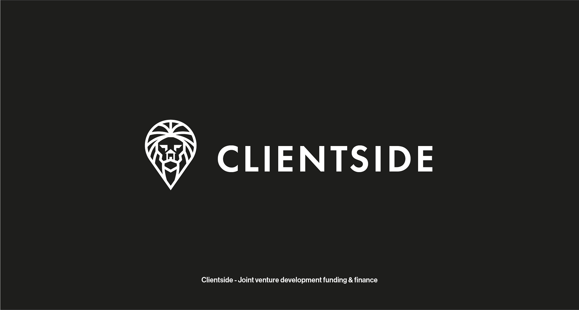
Logofolio
Client Logos 23/25
↑
Back to Top
This site uses cookies.
Accept
Decline