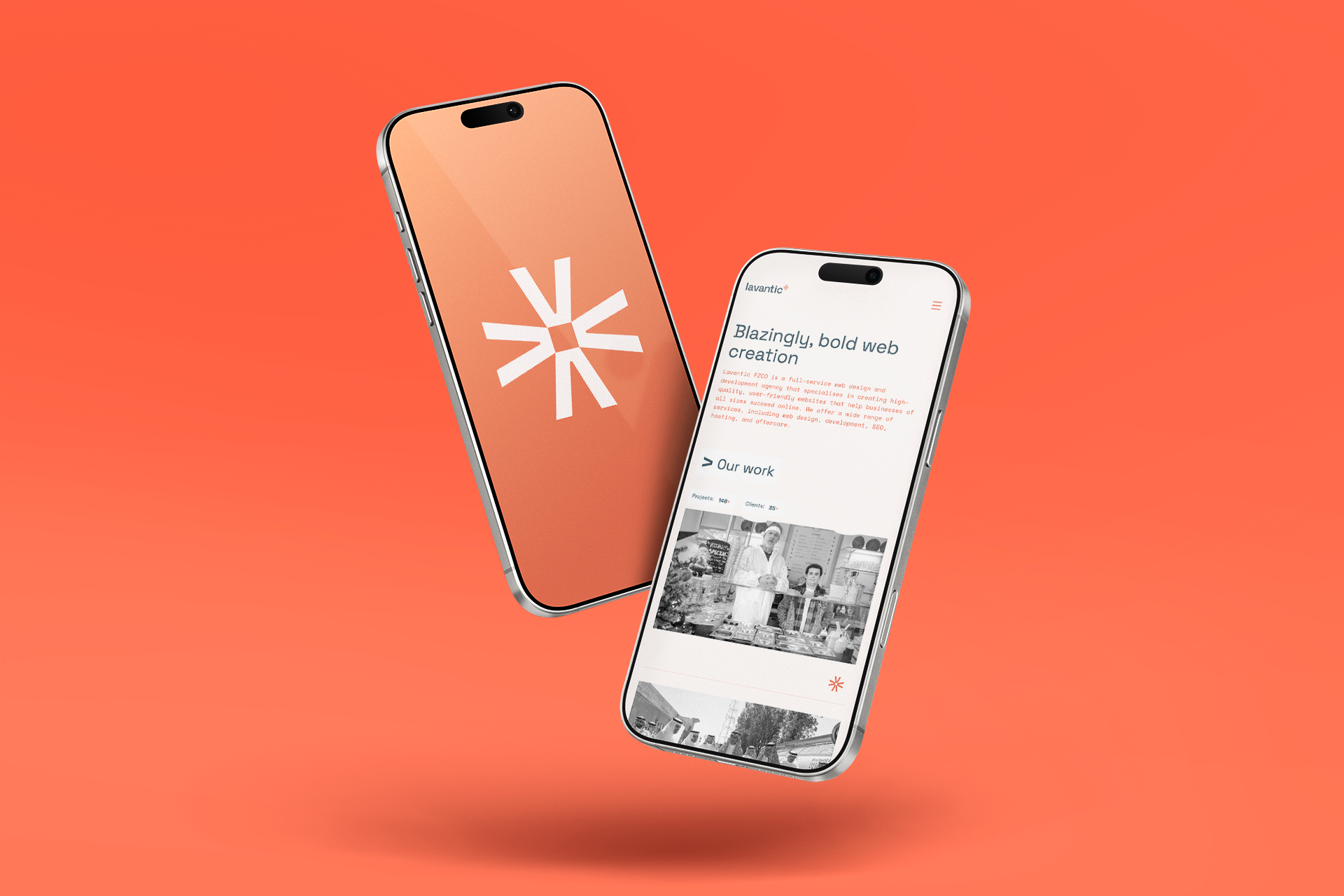
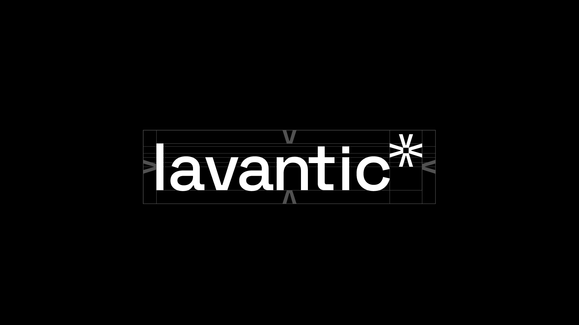
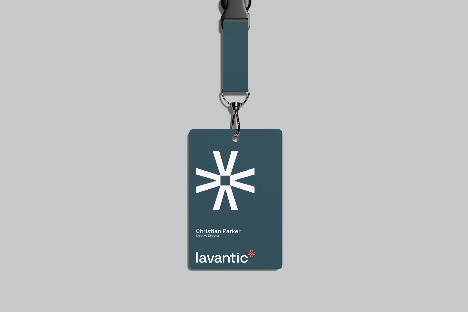
The Lavantic logo was designed to embody the agency’s creative energy and technical foundation. The logotype uses a clean, modern sans-serif typeface to convey clarity and professionalism.
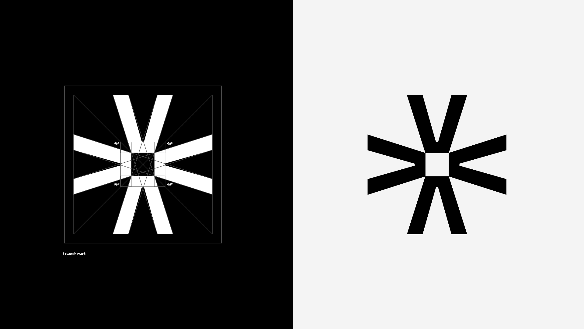
The icon originates from the letter “v”, which when inverted forms the shape of a volcano—a metaphor for power, creation, and eruption of ideas. Repeated four times, it transforms into a dynamic symbol that resembles an explosion, a spark, or an ignition—capturing the essence of innovation and the spark of inspiration behind every project.
At its core lies a square pixel, symbolizing the digital nature of Lavantic’s work and grounding the concept in technology.
The combination of these elements creates a bold, memorable mark that reflects Lavantic’s mission: igniting ideas and bringing them to life through web development.
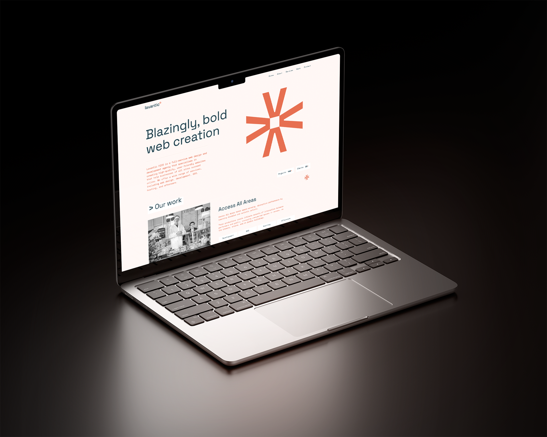
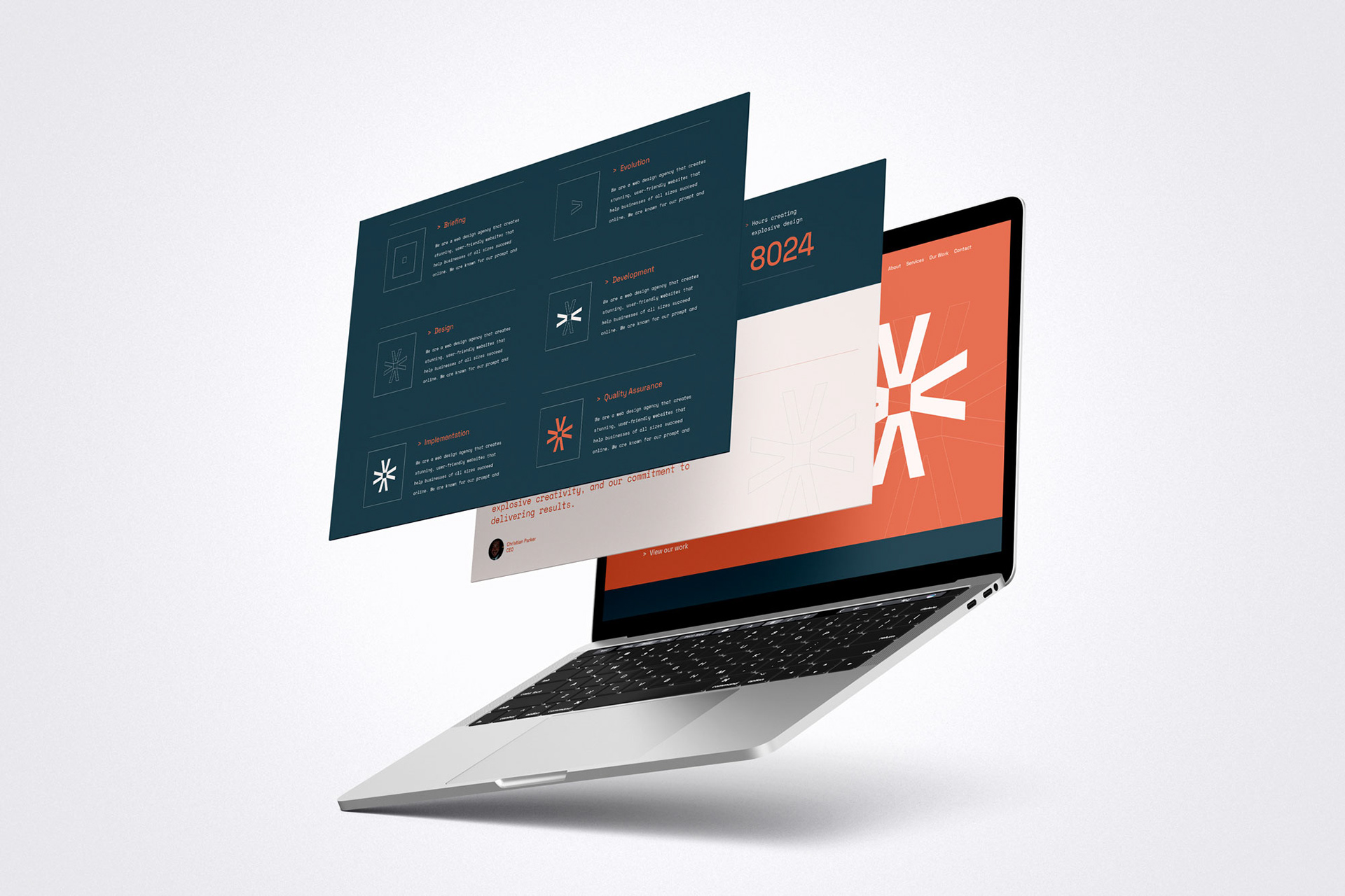
The Lavantic logo wasn't just a static image – it became the foundation for a dynamic brand identity. We leveraged the logo's core symbol throughout the brand experience, using it to visually represent the entire web development process, from initial brief to final quality assurance.
Imagine the logo's dynamic form morphing and evolving, reflecting each stage of bringing a website to life. This approach not only reinforces brand recognition but also creates a clear and engaging narrative for potential clients, showcasing Lavantic's expertise at every step.